Sectors & markets
Corporate identity and the logo by Creaman

Manuel Arquier, Creative Art Director of CREAMAN, offers advice on logo creation and corporate identity
Logos and related branding are fundamental aspects of corporate identity. They reflect a company’s values and goals, attracting customers and talent through all important first impressions.
‘Logos are supposed to talk about your activity, even in an abstract or symbolic way and, in the best of cases, express the spirit of your company,’ says Arquier, a veteran art director at the boutique graphic design firm Creaman
Arquier also argues that simplicity is key, have convinced clients such as Chanel, PwC and Moet Hennessy to opt for timeless design, instead of narrowly following the mode of the day. ‘Your logo must appeal to you without necessarily corresponding to the current trend,’ he says. ‘This will prevent it from going out of style in six months.’
He stresses that the logo is just the beginning of a company’s graphic identity – it does not have to be a static creation. A good logo can be complimented by additional visuals and design that help companies present in uniform and stylish ways.
When Arquier is working on logos for other platforms – such as printed material, corporate websites or other promotional tools – he looks for shared aesthetics with the company’s established visual identity. ‘I try to find a graphic link with the existing logo. It can be discreet: a common colour, an identical or similar typography.’
Setting trends
According to Arquier, larger companies tend to change design more frequently, thanks to larger budgets account and the need to stand out from their competitors.
‘They [tend to] work with high-performance agencies, which employ innovative creative people in order to stay one step ahead. An original message says a lot about the dynamism of a company. From this point of view, perhaps large companies are closer to trends.’
CASE STUDIES
Original logo creation
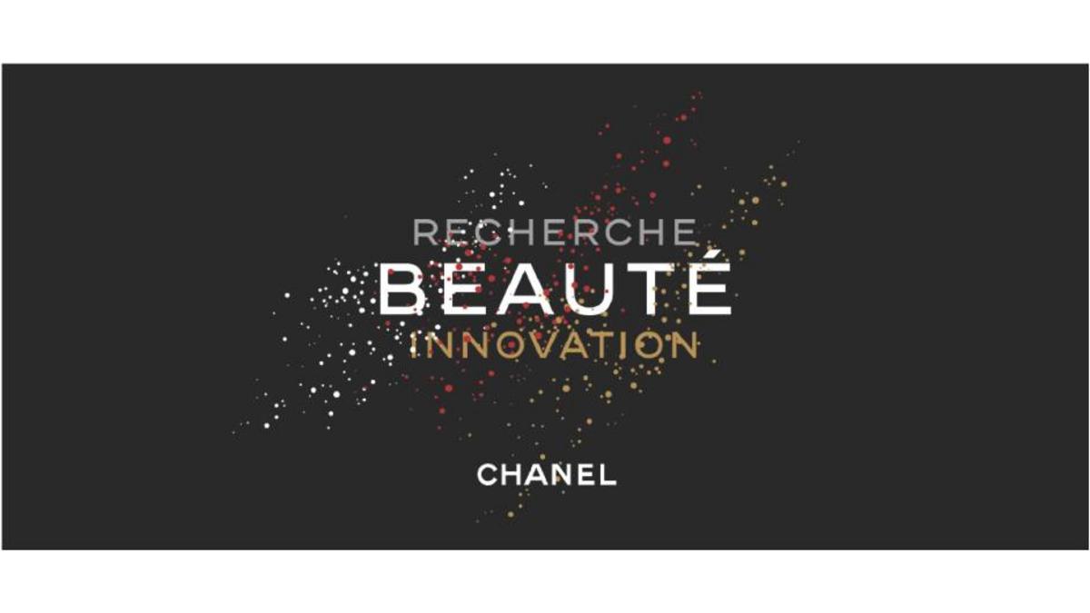
CHANEL regularly brings together the employees of the Beauty and Innovation Research department for an annual seminar.
To create a logo consistent with the brand's universe, I simply used CHANEL's graphic codes: black, white, their typography and of course their logo. Something simple and elegant had to be created: a good definition of luxury! A composition of moving dots seemed to respond to the brief: to express the innovation of a department dedicated to cosmetic research.
Logo re-creation
EGG’s logo needed a complete overhaul and had to express the qualities of a dynamic and creative events planning and productionagency, with a premium look. The only obligation of the brief was to use the simple and perfect form of the egg. It is represented here in a symbolic way and not purely figurative as in its previous form. It is composed of four fragments of different colours corresponding to the four countries where EGG is present. Four colours blend harmoniously to form a unique agency.